These are the final images that i had decided to use for my magazine. I had chosen these because I thought they would have worked well with particular pages that I shall allocate them on...
 Front Cover.
The first image was of "Charlie Pop" sitting with her head down. This is a shot of her showing emotion, which would get the readers to empathise with her. The way in which I had edited my image was by first of all rotating it so that she was facing the right. I had then adjusted the colour temperature of the image and the saturation of the image. This was to make the image seem a lot warmer, and took make the image much more brighter. I also used the colour replacement tool in order to make "Charlie Pops" tutu a lot more pink than it really was so that it stood out as a significant piece of clothing.
 Contents Page.
For the contents page i used the image that was of a worms eye view. As i took the image, the light reflected in the lense and this objected me from viewing "Charlie Pops" face. So the way i went around this was flipping it to the left so that the hair was on the left and it looked like "Charlie Pop" was looking into the sky. I made the figure of the artist black and white so that it would give a silhouette effect and contrasted against the background of the sky which remained in colour. I gave the sky a boost so that the colour had a much more higher impact and I cropped out the houses and fence in the background. The reason why I had made "Charlie Pop" look into the sky is because the feature shall read next to the image and say "Her Story So Far" by adapting the image as if she was facing backwards makes her look as if she is on a journey.

Article Page - Profile Picture.
For this image I had simply just cropped the image, and boosted the colour. I also changed the colour temperature to make the stairs appear more red. As "Charlie Pop" had a cool new kind of "Swagger" I used the colour replacement and made her pink lip gloss and skirt pinker.
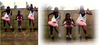
Double Page Spread.
This image was originally three different pictures that I had merged together. So that the image looked the same I changed the saturation and colour temperature so it looked the same as all of the other images I had used previously for the magazine. So that it became one, I softened the edges of the images so that I could place the image on top of another one so that it would blend together and create a smooth image that flowed continuously. After this so it had become one single image, I grouped the image as one.
No comments:
Post a Comment