My magazine develops on the conventions of contemporary music magazines as I followed a simple house style throughout the whole of the magazine by sticking to simple colours all the way throughout the magazine Purple, Yellow, Black and White. I had chose colours that wouldn’t have appeared to be bias as when I had conducted my questionnaire I found out through some of the answers that I had received that many music magazine readers thought that certain colours would imply certain things about a magazine, such as light pink would suggest a young girl as the reader. Also I had used one magazine throughout to analyse this is where I got my ideas from when it came to creating a house style for my magazine for example like on my contents page I had used the idea of putting each article in my magazine into an area out of news, feature and reviews. This made it easy understandable and avoided confusion with the reader. I developed on the conventions as the magazine is for Musical Theatre lovers, they are usually very creative and unique in what they do whether it be singing, acting or dancing. So for each page I had created a subtle background of various rectangle shapes and instead of having the title at the top of the page I had put it in the centre fold of the magazine. However when doing this I had to make sure that the writing didn’t appear right in the middle of the centre fold so that it could still be read.
Tuesday, 30 March 2010
In what ways does your media product use, develop or challenge forms and conventions of real media products?
How does your media product represent particular social groups?
There are various social groups represented in my magazine, it isn't for a particular youth tribe.
However you’re less likely to see "chavs/gangsters" wanting to pick up my magazine, as they are often seen to be not of the higher class, and be part of such activities that may be featured in my music magazine. Where as a social group of people that may be like "yuppies" that are mainly in a upper class would prefer to read this magazine as they may take part in social activities once in a while that may be included or I have written about. They may have a hobbies that include either singing, dancing or acting which are part of the musical theatre spectrum or with the family they may take a trip to the theatre every once in a while. The psychographic for people who may like to read my magazine as they would like to recreate themselves and go into a new direction of things and maybe develop themselves as a person e.g. gain more confidence unlike the mainstreamers as Musical Theatre isn’t the most popular genre of dance, not many people may pay particular interest into it and wouldn’t want to step outside the box.
What kind of media institution might distribute your media product and why?
The type of media institutions that could possibly publish my magazine are cinemas, they often show musical movies featuring famous celebrities that could possibly be featured in an issue of my magazine. Theatres because they often will have a direct link as it is musical theatre, and often in my article I will be publishing an article or a competition that is possibly being written or advertised in my magazine, so it could alternatively work in our favour. I publish them and they could promote me. Another media institution that could possible publish my magazines are very popular dance companies such as Pineapple or Bloch, dance companies may relate to them as the often include articles about "ordinary" people who happen to be in the industry and could be going through a same situation or maybe interested in what people just like them who are in the same competitive industry are getting up to. Also due to funding so that the magazine doesn’t get wasted in terms of the production side of things. Schools and Colleges who do performing arts could subscribe to the magazine at a small fee and hand out to those who wish to have a copy just like what they do with the Stage newspaper.
I feel that my music magazine may appear in news agents as musical theatre, isn't the most popular kind of genre. The magazine may start off a low price, but as the popularity of the magazine may increase the price may also increase, then moving onto bigger stores. A store such as HMV as they usually have so much going on under one roof, like now cinemas, arcades and cafes. HMV caters for all different genres including the most popular to the least favourable on the market.
I would like my magazine to be independent, as the specific genre like I had previously said isn't as popular as other music genres that are currently on the market already. So that means that when publishing my magazine I can not publish it for too much, as it hasn't got any recognition. I would then sale it in direct shops that have links to my magazine, like the dance and theatre companies. This means that when the money has to be split, to work out how much money has been made from the sales of my magazine. I would get more than I would have if it was a big publishing house.
Who would be the audience for your media product
The demographic for my target audience for my musical theatre magazine - Expression.
Is both male and female. I would consider the age range to be young adolescence through to young adults. This is because they would appreciate and understand the industry and the process that goes on within in it.
I haven't directed my magazine at any specific class, as I would want everybody to be entitled to read it however as it is a musical theatre magazine. The likely stereotypes that will be associated with this specific genre are that you are possibly higher class as you probably go to the theatre every week maybe or every other week. Also you may be part of an all rounded stage school that deals with all three singing, dancing and acting. Being part of a stage school and taking occasional trips will though work in your favour when reading this magazine as it does to some extent revolve around these things, but my magazine is written in a way that even if you don't participate in these activities you will still be able to understand the magazine and the different features inside of it.
How did you attract/address your audience?
They way in which I had gone about choosing my specific target audience were conducting my research. I had done a questionnaire and one the questions was what genre of music do you prefer. One of the groups that had got the least was musical theatre. This is because I feel that many people are not aware of this specific group, and I think that many people feel that in order to enjoy musical theatre you must attend the west end to watch shows every other week. This had made me feel that many adolescence where unaware, so I wanted to create a magazine that could prove them wrong and let them enjoy the this genre as well as the minority that already.
The way in which I had gone about drawing my target audience into my magazine, is by having a new artist who is up and coming with a different kind of swagger/image. I chose to make my artist a young teenage girl who isn’t posing in a particular way to stop a specific gender on wanting to read the magazine but I had allowed her to pose in a casual pose so that you can tell that it is so for both genders she is wearing clothing that are currently in trend as the readers may look at her want to be her. I didn’t want to make my magazine just for a specific genre so I used colours that wouldn’t suggest a particular age or gender. Expression is a Musical Theatre magazine for young adults; however I didn’t want it just to be for Musical Theatre lovers. I wanted everyone to be able to read it and understand the magazine. So it is broken down into sections. The main article would appear on the front cover and would usually have a gossip vibe to it. So that you would feel that it’s worth reading as you shall be getting information that no other magazine may have.
I needed to bring a creative and energetic vibe to my magazine. On my front page I have a typical bold all in one height font, but as it’s called “Expression” I used a font that had brushes imprinted into it so it had a different kind of liveliness to it. The colour of this was purple as it would stand out and contrast against the main image.
I used puffs on front cover that wouldn’t only make people of the specific genre want to read, but also people from outside of it. Having puffs such as “Sexiest Show Guys and Girls” it would draw in both genders and create a sense of community as it’s an opinion matter you may be reading this magazine with your friends and start a debate on who is actually the sexiest.
What have you learnt about technologies from the process of constructing this product?
The things that I have learnt about the technology process of programmes like Photo shop and Fireworks, is that they can be used to easily manipulate an image in a certain way that would look much more appealing than what it would have originally compared to the raw image that it previously was. Photo shop consists of many filters that give certain effects that are used on many magazines. A filter that is used majority of the time is Surface Blur, this works as an air brushing effect. This effect is used on many magazines to edit models, celebrities etc. This then makes the image of the person look flawless, this portrays an image to the audience which then makes them aspire to be just like them.

There are varieties of filters that you would be able to use in various magazines. The surface blur effect can be reversed; you can blur the background for example to make the image the focal point. By hardening the brush you then make the blur extra hard so that there is an automatic focal point of an image. Another technique for photo shop that I have used was colour replacement. It’s when you chose a colour from the image from the palette to change the colour of a different object that may be in the image. This is what music editors may use to brighten and image, or manipulate it in a way to give a certain effect.

Another way, in which photo shop allows you to manipulate an image, is by cropping and giving the previous background a transparent background. I had done this for the image bellow, with the model in jump pose. I had cut all the way around the model, but where the models hair was very curly I had cut a section of her pony tail off, and placed it in a new layer to make it look as if it was in a bun, I had also done this to make her hair look a lot neater as she is suppose to be a dancer and they are usually very presentable. After I had done this, I grouped the picture and put it on a gradient background. This then formed a whole new image. I straightened up the dancers pose, from the raw image as at first she was at a lean. The way in which I had rotated the dancer/model on photo shop is by using the straighten tool, and drawing the line in the direction that I had wanted it to go on.

Looking back at your preliminary task, what do you feel you have learnt in the progression from it to the full product?
Whilst looking at the preliminary task, I had felt that I had learnt a lot in terms of the convention of a music magazine. The main magazine that I had looked at throughout the whole project was Q magazine. I had chosen this one as this is one of Britain's leading magazines.
The colours that they had used throughout the whole of the magazine reflects their specific target audience, the colours are neutral to both genders, red black and white. However at times they could be considered bias towards the male sex. This was because they had advertised certain manly things such as cars, also another more specific example is that they had advertised Braun, “Shave free weekend. Pain free Monday” with an insert of their quote. New razor for men, designed to “make a difference”. This wouldn't appeal to woman, but on the other hand it could as a gift as it was published during the Christmas period.
Music magazines on the market all vary from genre to genre; they have specific colours for specific groups of people. For example Smash Hits, this magazine was directed to young females. As they have images on the front cover of males that they would consider "hot" from famous and popular movies. The colours and fonts that they use are all very girly and bubbly. They would use colours that are pastel colours with a black outline around fonts as this would make them more eyes catching and bold and contrast against the rest of the page.
An example that I had picked up on whilst analysing music magazines are that the younger the target audience/reader the more packed and cramped the front cover and articles would be, they would have teen pop stars that the younger generation would appeal and or thrive to be like. However when it comes to dealing with magazines for older generation the pages and layout becomes much more sophisticated. The colours that are used become minimal, and the images and photos become a lot more professional.
Photo shoots would be different from genre to genre, and depending on the age group. An urban magazine photo shoot could consider of a specific image and look that an audience is used to seeing as a background or part of the set, as a new up and coming artist could have a photo shoot at south bank in the tunnel with the graffiti background. Where as a jazz magazine style would have a specific lighting and image edit, the texture of the image would be edited in a dull types of colours and wouldn't be as bright and high impact as a musical theatre magazines images would have.
The article in magazines contain different aspects, as young music magazines have interviews with celebrities and the latest craze "teen hotties" as at the moment of the release of New Moon - Twilight Saga, on every front cover there are the stars of the film Taylor Lautener and Robert Pattinson, even though they do not relate to music they know that by putting specific kinds of people on covers of magazines they will automatically draw in the readers. Whereas on more sophisticated magazines for the older generation they may have paid commiserations towards the King of Pop Michael Jackson, as he was respected by all genres of music as he was to have influenced them all in some kind of way.
The Stage - The Website For the Entertainment Industry. Musical Theatre, Performing Arts and Tv.

Final Magazine.
slide one - front cover
When creating my front cover, I had tried to stick to the generic layout of a music magazine. I did this by having the usual house style of a picture of the artist that usually relates to the interview that shall be inside. For example "The Backaches, Heartaches and The Flops" which isn't a happy caption, but it is an intense one. So this is why I had chosen the image of "Charlie Pop" looking down to capture the emotion that she is portraying.
slide two - contents page.
For the contents page, I was influenced by the house style of Q Magazine. This was because they made it very clear of what is going to be inside the magazine by breaking it down into sections such as "news" "reviews" and "features". I had brought this over onto my magazine as I knew that organisation is a key concept for the visual aesthetics of a music magazine. They also had an image that took up majority of the page, the image was usually significant to that particular issue. With my magazine, I had adapted that an had an image of my artist as this was a "world exclusive interview".
slide three and four - double page spread.
My double page spread feature played on the conventions of successful music magazine. As I had followed the generic style and had the article on left hand side with a headline that would capture the reader and want them to read on, and on the right hand side I had an image of the artist herself. On this page there isn't usually just writing, it usually has quotes on it also that play an importance to the article.
Picture Edits.
 Front Cover.
 Contents Page.
Double Page Spread.
This image was originally three different pictures that I had merged together. So that the image looked the same I changed the saturation and colour temperature so it looked the same as all of the other images I had used previously for the magazine. So that it became one, I softened the edges of the images so that I could place the image on top of another one so that it would blend together and create a smooth image that flowed continuously. After this so it had become one single image, I grouped the image as one.
Planning my Photoshoot.
I am planning on taking pictures in an open space outside so I can get a variety of shots and angles so that I am able to take advantage of the space and the natural lighting.
I will take various mid length shots, and close ups. These type of images shall be for my article page and my front cover.
I will then take more full length and creative images for my contents page as this is that is the page that you go straight to after the front cover.
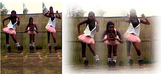
Here are the photos that I had took in preparation for my magazine.
Representation of my Psychographic.
Nicest Kids in Town - Hairspray Inspired Routine.
Popular - Wicked Teenager Singing.
The individuals in these videos whom are singing and dancing represent the psychographics of my magazine, as they are the particular types of people who I would want to target my magazine at. They pay a particular interest into the specific genre that my magazine is directed at, Musical Theatre. These individuals are all usually creative, outgoing and confident. These are the aspects that I would like to be reflected in my own magazine.
Monday, 29 March 2010
Draft Magazine.
Key Demographic of My Magazine.
This magazine shall be for both genders, as from the research from that I had conducted I had found out that both males and females like magazine that are directed to both sexes. This then means that I have to maintain a magazine for both genders. The external features of the magazine cannot be bias but must mean that both genders would be able to look at the magazine and would want to pick it up as the puffs have to draw them both in. The mode of the address could be considered the most important criteria when planning a magazine in general. As you need to make it clear on whom you are directing it at, as you have to be very specific and apply these things to the visual aesthetics.
My magazine is going to be for adolescence and young adults; I'm going to make my layout be as sophisticated but bold at the same time without losing the effectiveness of the magazine. Also as at this life stage adolescence and early adulthood are usually full of energy and energetic, this means that the articles I include in my magazine must be enjoyable and worth reading as you usually have to work hard at engaging such a specific audience. As they are usually hard to please, you have to please the majority as the majority is what is going to sale the most money. As my demographic is for young people I would like to make the magazine have an exciting feel to it. I shall go about doing this by having a new artist as the main feature of the magazine with a gossip kind of feel so that they feel what they are reading you can read anywhere else.
The colours that I will chose for my magazine, are also very important as I found out again from my research that specific colours on a front cover of a magazine or there iconography is very important. As certain colours suggests certain things to the reader. For example pink suggests that it is stereotypically is for girls, and a paler pink is for younger girls. Working in reverse this suggests the same for boys, but with the colour blue. So when it comes to preparing my magazine, like Q magazine I'm going to stick to a minimal amount of colours. For the cover so it appeals to both, the majority of the magazine is going to be of greys whites and purple. However as it is a Musical Theatre magazine, this particular genre can be somewhat "cheesy" so for the inside pages my layout shall be the same continuing the greys and whites thought out, but for each page there is going to have background of transparent shapes in the background. This brings a more exciting approach to it.
Whilst looking at various magazines, the mast head on each becomes very similar and typical. This is that usually most magazines claim to be the "Britain's Best Magazine..." of whatever the genre or type of magazine may be. I'm going to carry on with the convention of this and put this forward onto my magazine. This would then improve the aesthetics immediately as when the reader reads "UK Number One Music Magazine" they will get the impression that my magazine will be one of a kind.
The most famous popular musical theatre magazine is "The Stage". However this isn’t really a magazine, as it is set out in a news paper form. They have a website which is for the entertainment industry. They set out the newspaper in a way that breaks down the different aspects of their product which I would like to bring forward to my own magazine. This makes the magazine a lot easier to read and much more understandable.
Mood Board - Fonts.

When exploring the different types of fonts that are relevant to musical theatre. The most used ones that occur when dealing with a specific genre such as Musical Theatre is that they are usually sharp, bold and sophisticated, well defined and in capitals. This makes them easy to read with no complications.
When experimenting with various types of fonts, I had found that the simplest fonts were the most effective ones. This made it easier to when needing to influences an less complicated font, for example the font Lion King they looked effective when in small capitals where as new face book was too complicated to read, which if on a cover of a magazine would look to messy and unattractive to an end user. More complicated fonts that are already have been manipulated in some sort of way are then harder to do even more manipulations too. For example as old blocks was already in capitals, when putting it in small capitals it didn't really make a difference, it showed less effectiveness that it would have done with a slimmer font such a Sanford.
Mood Board - Colours.

When looking at the colours that are usually associated with musical theatre the majority of the time they are bright and bold. They usually stand out majority of the time as they are usually contrasting against a basic sophisticated
Mood Board - Images.

When looking at the mood board images for musical theatre, there isn't really much going on. There is usually just a centre point of an image, that stands out from it background. The picture is usually got a high impact of colour, with the main focal usually being very sharp.
However just because the focal point is the main image, doesn't usually have to mean the background will necessarily be plain and boring. For example the image in the bottom right corner, you can see that the main image is of the dancer striking a pose, but where they have manipulated the image not only for the dancer to stand out but to add more effect to the image. The whole background has been blurred from the centre point being the brightest of a white flare then gradually getting darker as a gradient from grey to black. An effect of lights on the stage have been added by using brighter white circles. Such simple effects can have great impact on photograph that probably just started out as a dull image. This is an idea that I would like to bring forward, as I shall have an image of a featuring new artist.
Questionare.
When planning my music magazine, I had done a questionnaire as part of my research. I asked 10 students of the age who would have read my music magazine which was 16 and 17 years old. The Adolescence's were of both male and female. These are the results i had found that i then produced into graphs...


The conclusion that I had drawn from the studies that I had gathered was that nobody actually goes out of their way to read a music magazine, this is because maybe everything that they have in magazines usually appear on music channels already nonstop and also on radio stations. So the information is usually constantly always being fired at you for free, so there is no need to go out and buy a magazine. Majority of the time magazines are usually costly anyways, as they are ram packed with information and as they want them to look appealing and professional usually processed with high quality in using high quality paper. The majority of people who I had carried out my research on had preferred a full size A4 magazine to the convenient A5 one. This may have been because they liked images in full sized, and the information spread out over many pages. They may find presentation on a music magazine a vital part of its aesthetics, when it comes to wanting to purchases a certain magazine. Also they may think that the smaller the magazine the less information that may actually be in there, so by getting a bigger magazine may result in more information, for the better value of your money. Generally with music magazines, my studies showed that minority of people would actually a buy a magazine this was 3/10 people, and 2/10 people said they would borrow a magazine. The remaining 5/10 people said they would do borrow a magazine. Suggesting that it’s not a priority and maybe not even worth the trouble or time to go out and buy a magazine, which you could get via television programmes, Internet or radio. This then leads on to my next findings as the decisions was split 50/50 as there was no higher result for people who had preferred an online magazine to a paper printed magazine. Magazines didn't seem that popular especially as only 1/10 people said that they actually subscribe to the magazine, the rest don't find magazines that worthwhile and or interesting in order to have to subscribe to a magazine. The result out of my ten questions that got the most straight forward answer without no complications was the question dealing with gender based magazines, 10/10 people said that they would prefer a magazine that catered for both genders, not just girls or a boy magazine. This is a good thing, and easy for a publisher of a magazine as because they can then cater for both genders dealing with one magazine. However the complications that could arise when dealing with this is that you may prioritise a particular sex, by accident without knowing it when creating your own magazine. I discussed the issues with a specific colour when you buy a magazine and what information you got or interpreted when you looking in at a magazine, the colour pink got the stereotypical role of it being a girly magazine as usual, and for younger readers. A particular genre that came up when talking about the colour pink was pop. The colour blue also had the typical stereotype was it being for boys, but it also had suggested maybe the colour blue was for calmer readers. Black had the connotations of being for genres such as Emo, Rock and Punk, this was because these may had been seen as dark and aggressive. The colour white had been suggested that these magazines with these particular colours may have been for older generations, magazines such as weddings ect. It represented purity. Red was somewhat aggressive, even ambiguous. As it gave two meanings that somewhat contradicted itself, for example red suggested love and romance where as on the other hand it was suggested it was seen to be aggressive and blood. Another aesthetic situation that arises when dealing with a cover of a magazine is what is actually on it. People I asked, about magazine front covers are that what they find more appealing, what captivates them in order to having to buy magazines. They had said that the main thing was the centre image like the celebrity that appears on the cover, and or the headline. These two categories had 5 points each. Freebies then got 3 points, this I what motivates an end user. It makes them feel that the magazine is worthwhile when it comes free with a gift. With 2 points each was the actual colour of the magazine and the puffs. The least important was the actual name of the magazine, they didn't consider whether the magazine was name brand or not. This wasn't relevant to them.
Q Magazine - Double Page Spread Analysis.
Q Magazie - Contents Page Analysis.

When analysing Q magazines contents page, the house style of the magazine continued from the front cover onto this centre spread page.
The contents page contained a very clear and generic layout which would appeal to their audience as it is not just writing but also large images of recognisable artists and band. Q magazine also included on the front cover image as a small icon in the corner of their page as like a signature. This is an idea i would like to carry on to my own magazine. The contents page doesn't just simply state the what’s on each page, but gives a brief introduction to each page and what it includes.
Q Magazine - Front Cover Analysis.

When analysing my magazine front cover, I had found that the house style of the magazine, the generic layout was the same through out every issue. They had used the same colours throughout the whole magazine, from page to page. The colours that they had used were red black and white. These colours are not bias towards one sex, or a specific type of genre. By using these contrasting colours for the cover, made it appealing for everyone. This is something that I could pick up on for my own magazine, as this would entice all kinds of people, and not leave a specific genre out.
Q magazine had also only used one main image as the focal point for there cover, this was simple image that was manipulated to make more effective. The band members where holding a Q award, which was in gold. This then colour co ordinate with the rest of the magazine as this was one of the main colours of the cover. The visual aesthetics has been put to good use, as the creative use of colours allows the puffs to stand out and contrast against the image. The aspects of the actual magazine, has been put bluntly which makes the reader aware of what exactly they are going to be getting involved with when reading or buying this issue of Q magazine. The iconography that is throughout the whole magazine portrays the fact that Q magazine feel that they are the best and they take pride in themselves and their readers, it's like repetition. Us seeing this image repeatedly is giving the impression that they are the best, that they are something to be proud of. They know best, and they are the best. The frequent use of the image also allows the reader to be more familiar with the logo making Q well known and popular. By not using a lot of images all over the page and sticking to three or less colours makes the magazine look more professional and Superior to the rest of the magazines on the market. The mode of address in Q magazine, is sophisticated but also has an edge of wit about them. Under the post of 50 Best albums of 2009, they inserted a tag line of "this may cause arguments". Implying that the people who will be reading and or purchasing this magazine, is directed to a wide variety of people, and it occur a diverse opinion from people to people. Having a joke, or a pun on the cover of a magazine allows your reader to feel more involved, it allows them to see the fun aspect of the magazine.